Tack Room
Visual Identity
Environmental
Bricolage
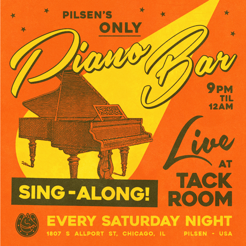
Tack Room is an intimate piano bar and performance space located at the street level of Thalia Hall. The bar has served Pilsen for over ten years alongside its counterpart, Punch House.
While this space had branding established with its opening, the bar was expanding its programming, wanting to extend their marketing reach and increase appeal within its locale in a vibrant, working-class, Latin neighborhood. The existing logo, font, and colors were to be maintained but expanded upon to bring new attention to the space.
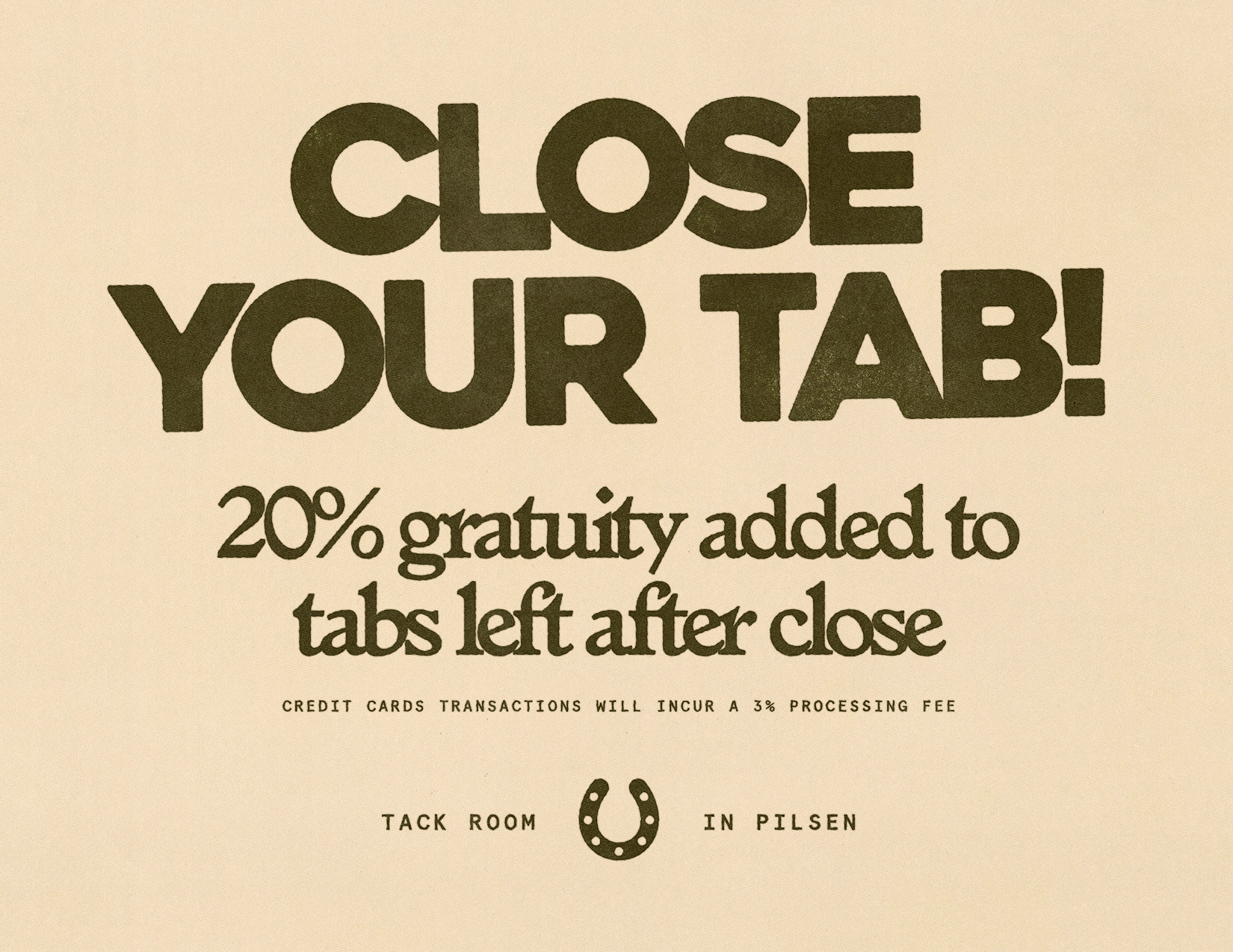
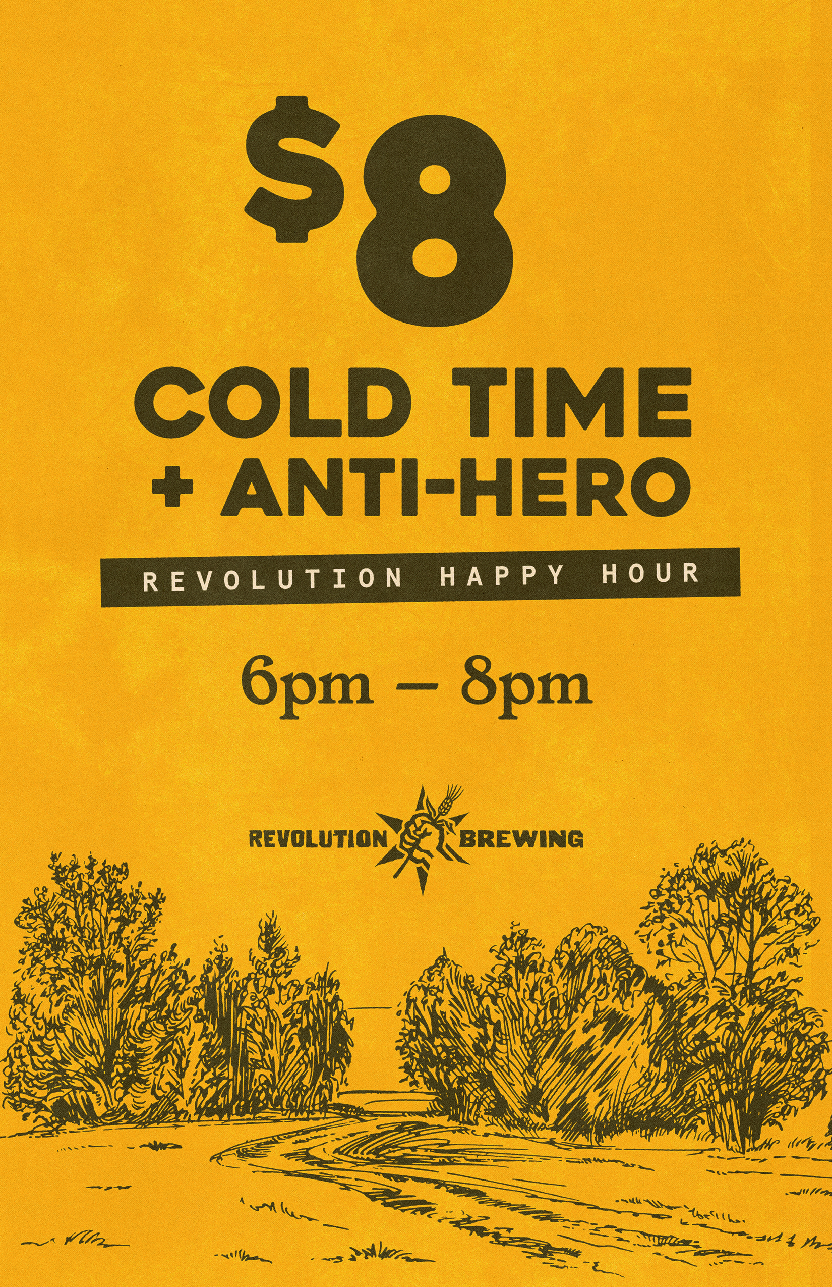
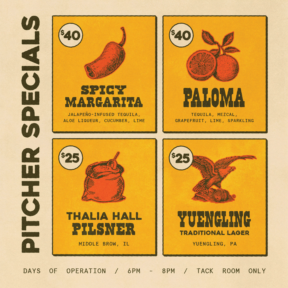
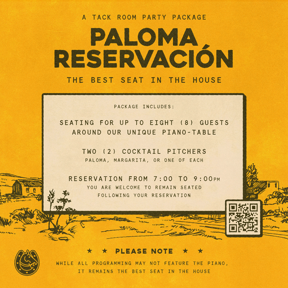
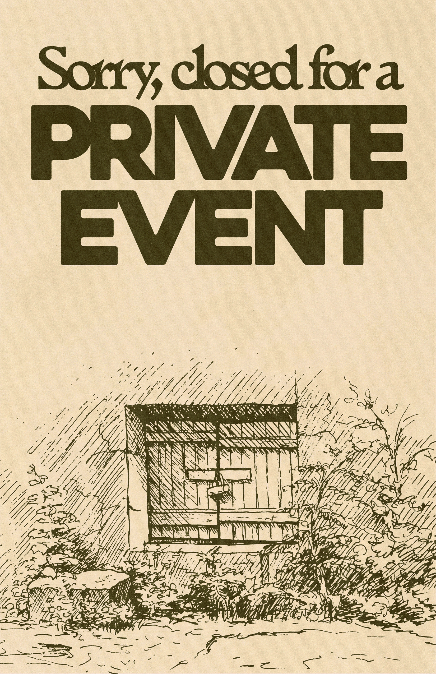
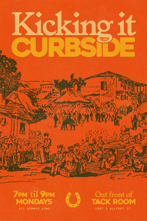
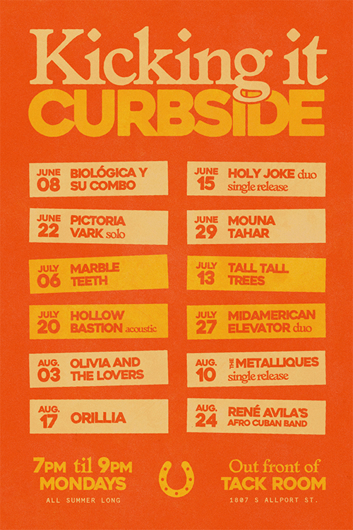
New environmentals, menus, and on-site ad material were established to replace swift solutions of the bar staff and unify appearances. Establishing an illustration style and brand voice enabled cohesive construction of templates and brand assets to return agency to bar staff.
Social
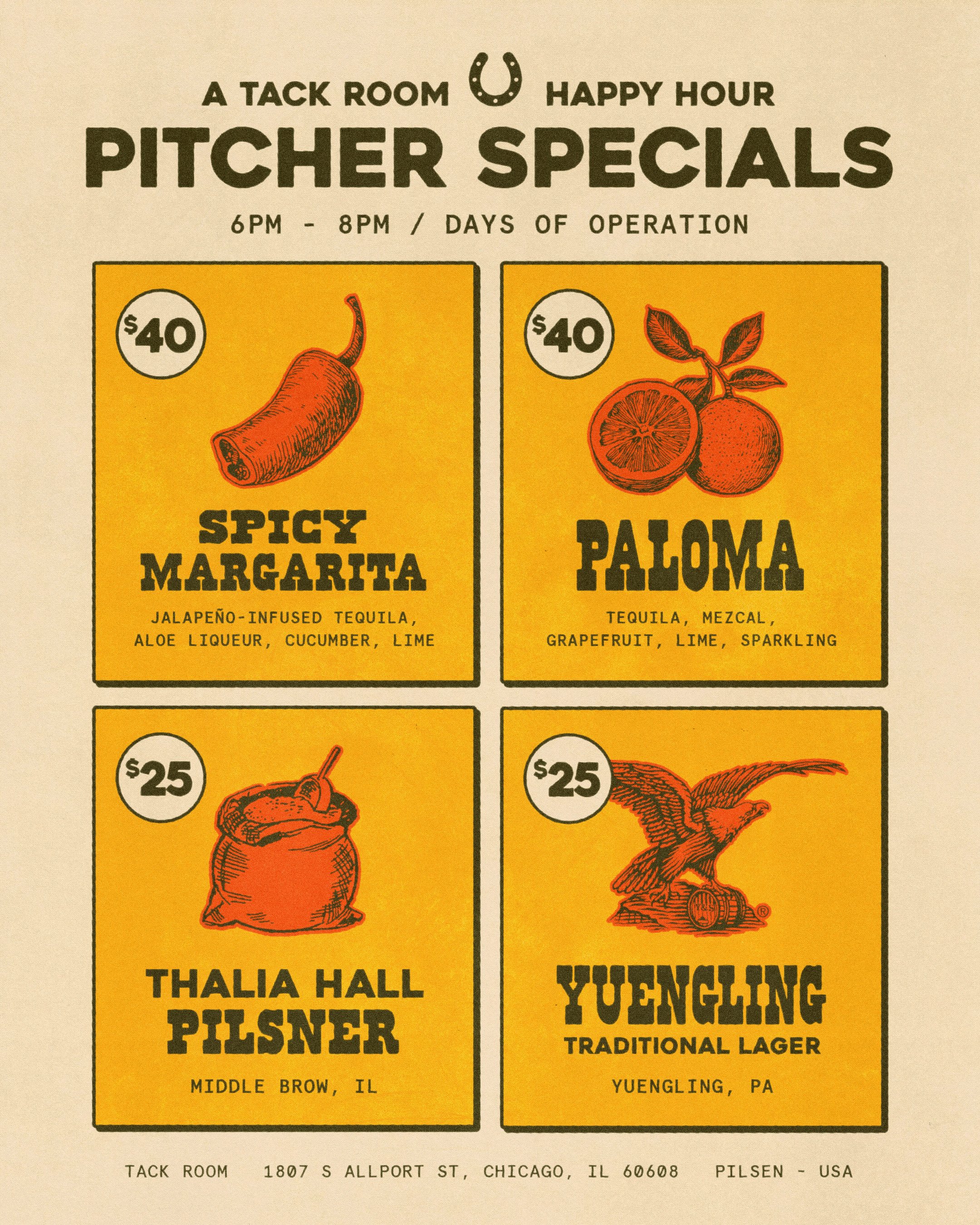
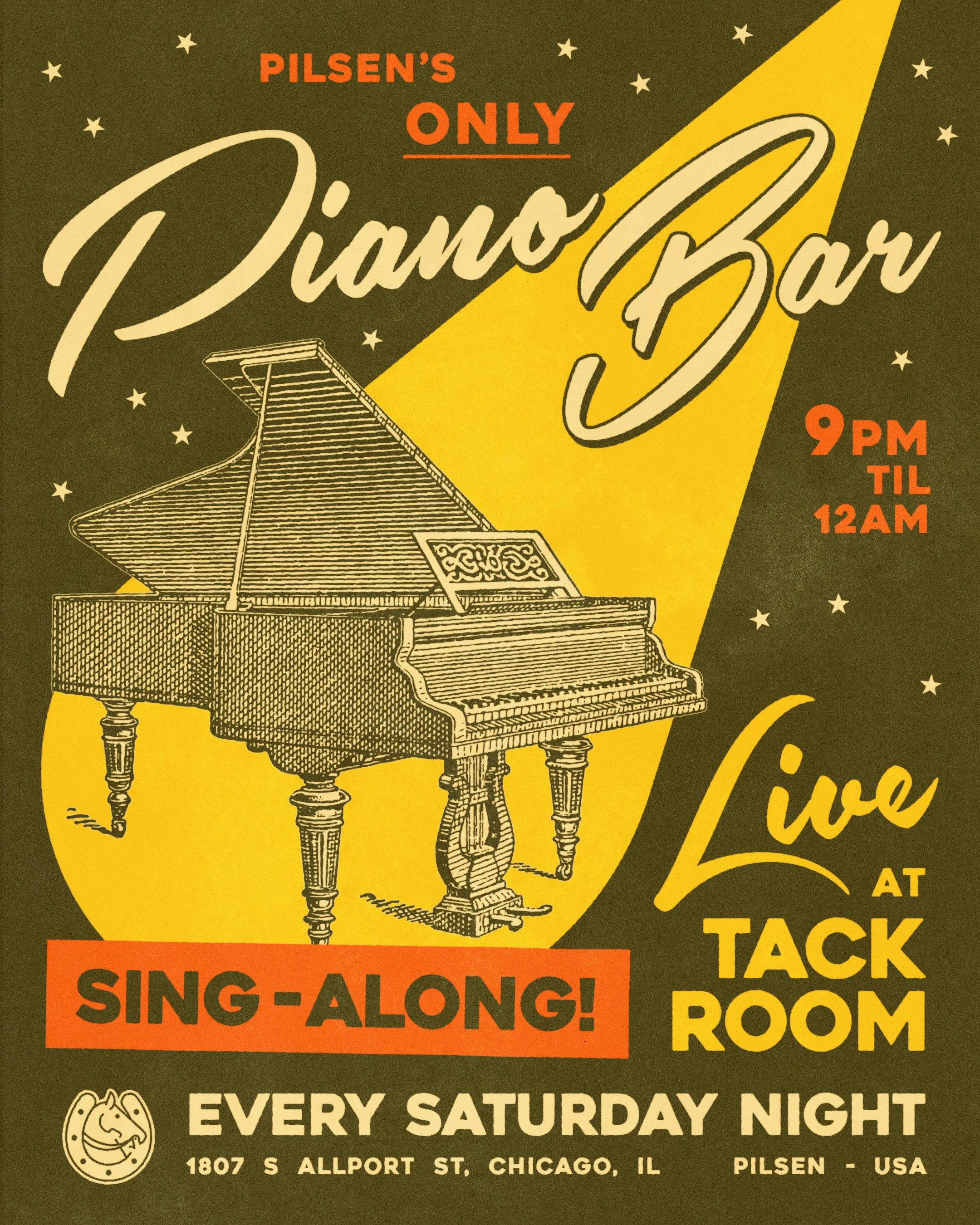
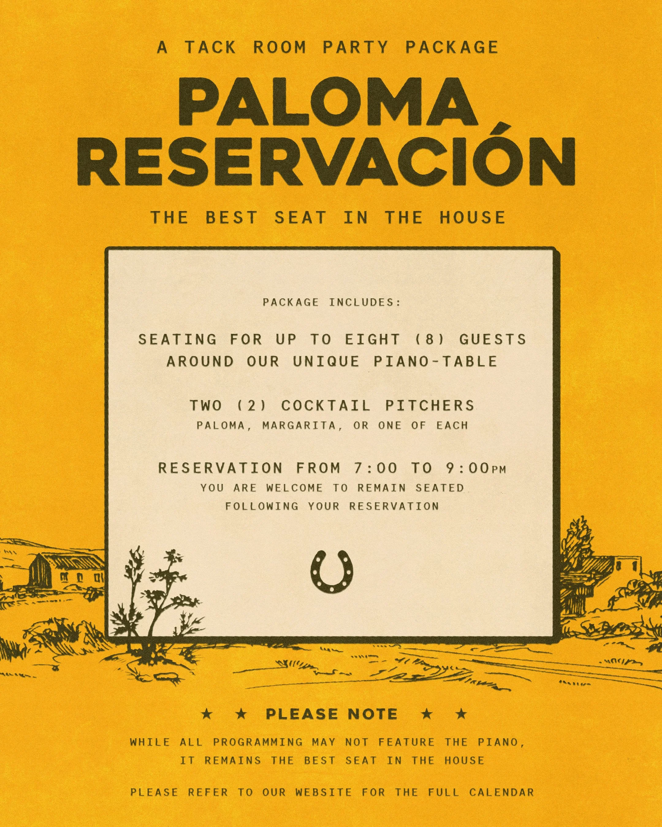

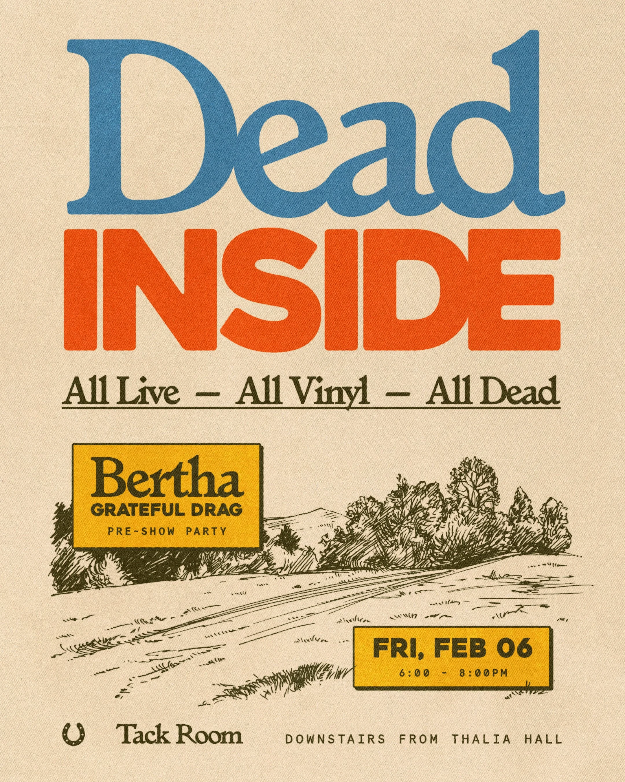

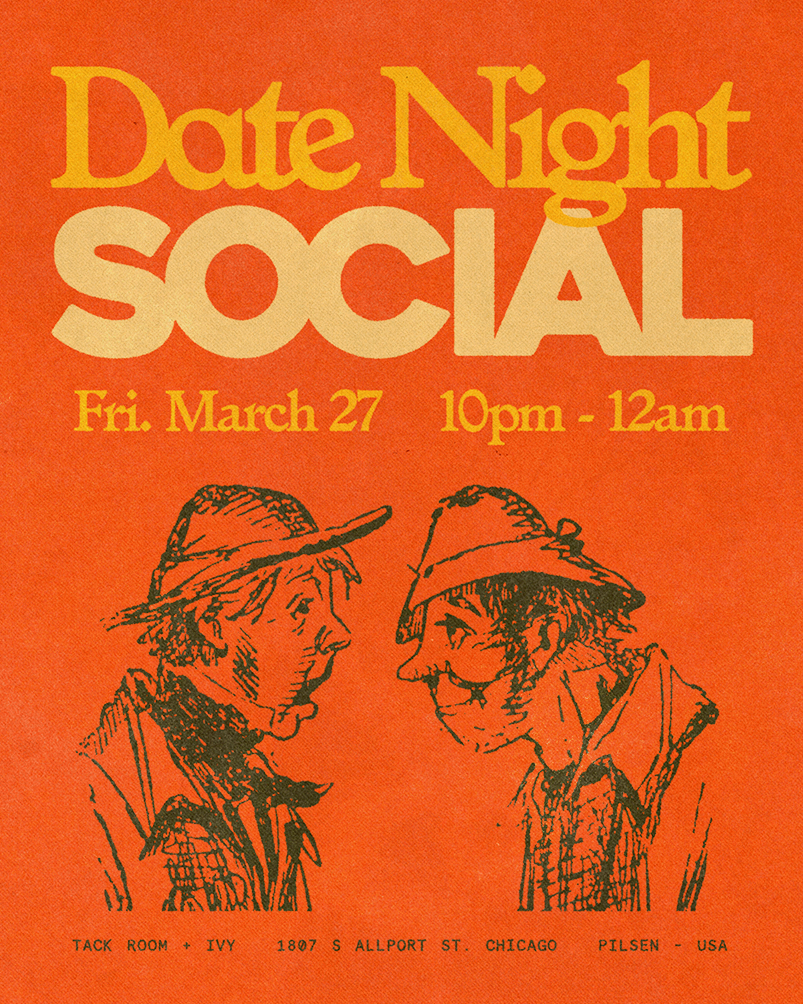
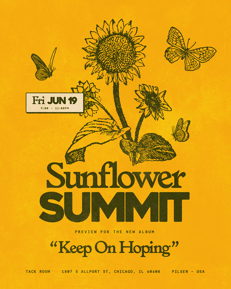
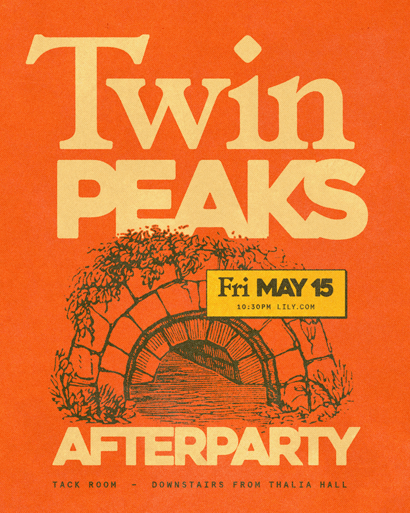
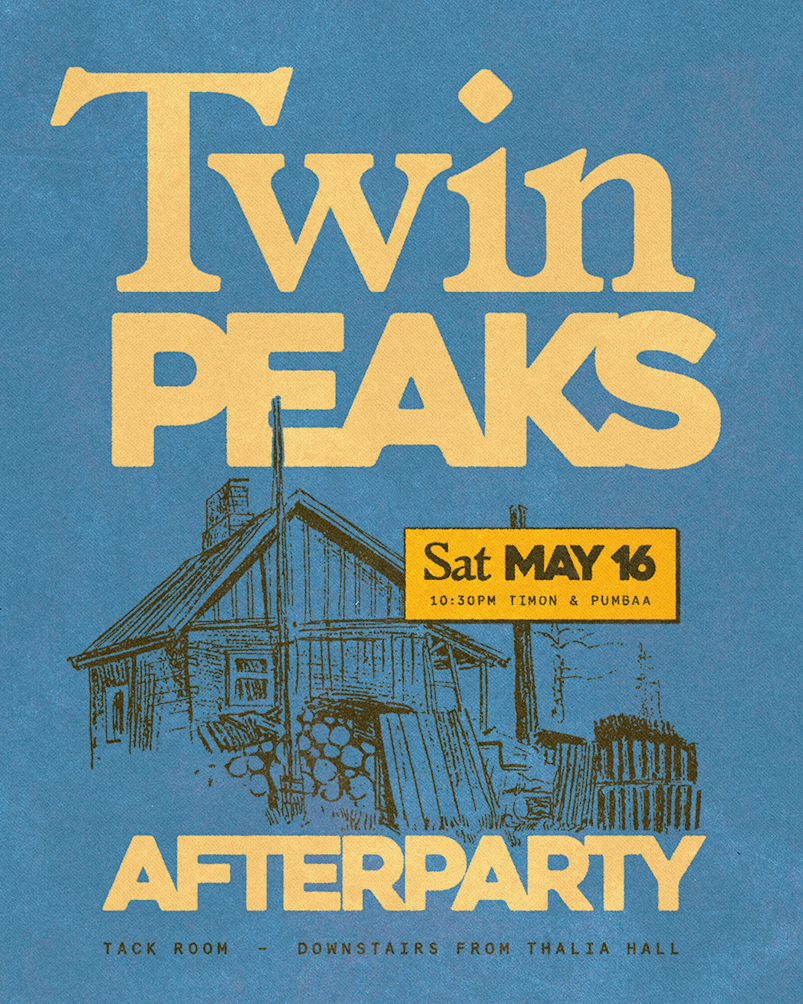
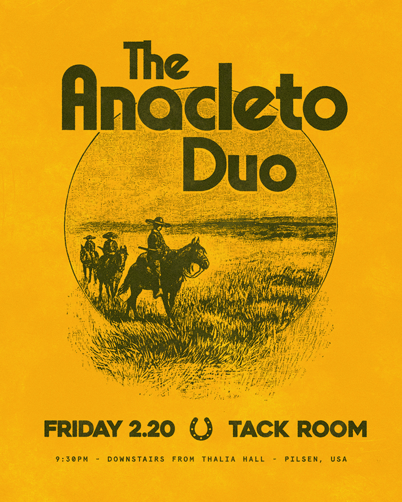
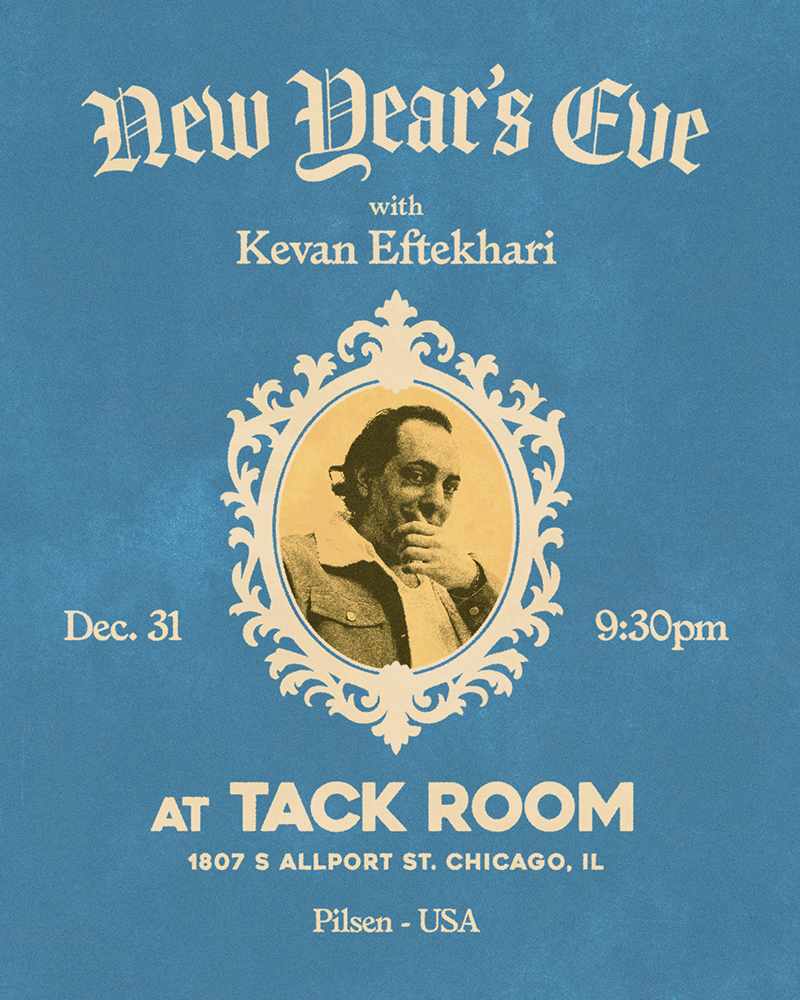
Brand Refresh
Originally founded as the backroom bar to an American gastropub, the space was orphaned after the tavern’s closure. Replaced with a vibrant, mariscos restaurant more poised to the community, the bar’s equine identity grew feral without it’s parent concept. Shifting focus from late 19th century Chicago to somewhere ambiguously southwestern, the space began to realign with the new key-tenant.
Implementing a high impact display font allowed for clearer hierarchy, enhancing voice both in on-site environmentals and via social media. Promoting accent colors from past material into essential brand colors aided assembly into something more expressive while conserving the visual legacy of the past ten years.
Color Palette


White Linen
#F5F1E0
Walnut Brown
#444430


Golden Honey
#FABA46
Aged Parchment
#F3D29B


Raw Denim
#4088BC
Red Paprika
#F05332
Typography


Voice
Small, dark, and unbothered, Tack Room is a bare bones space rooted in the character of its locale. It wears its shortcomings lightly, leans into its scrappy nature, and doesn’t pretend to be anything more. Methodical use of the Spanish language engages the neighborhood in a dutiful way without tongue-tying the target audience.
Self Aware
Casual
Spanglish
Illustration Style
Maintaining the freehand style, I sourced sketches of bucolic, southwestern landscapes to parallel the straddle of Americana and Latin music programming. Introducing woodcut style illustrations compliment both vintage printmaking as well as more traditional Latin linocut, bridging the cultural shift sparked by the new tenant.




Environmental & Ephemera